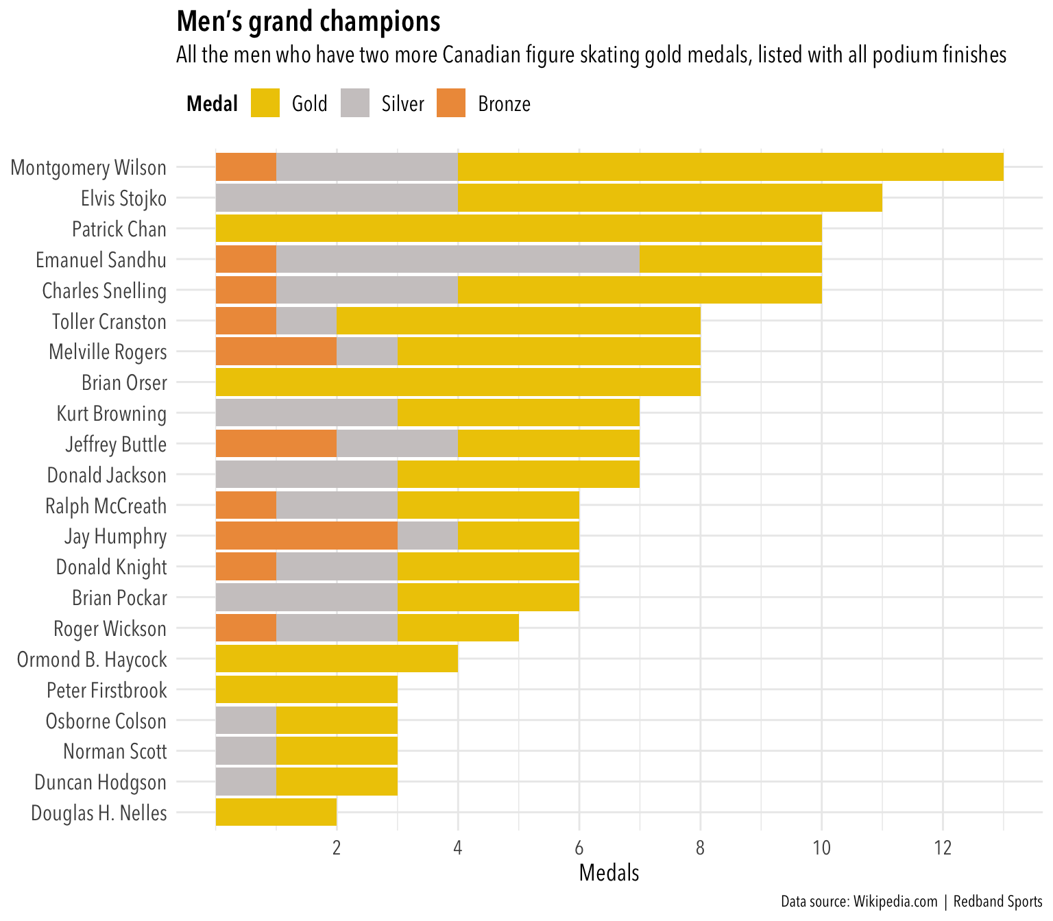
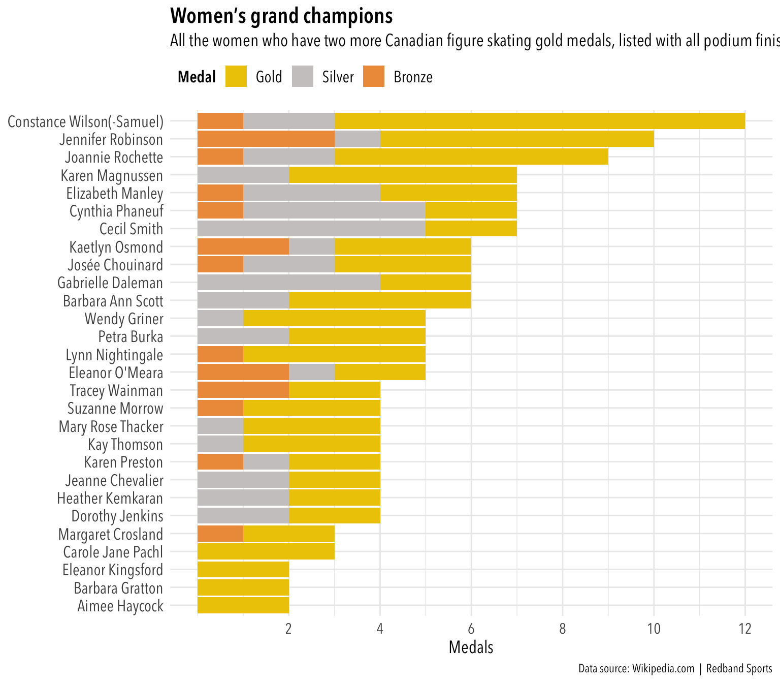
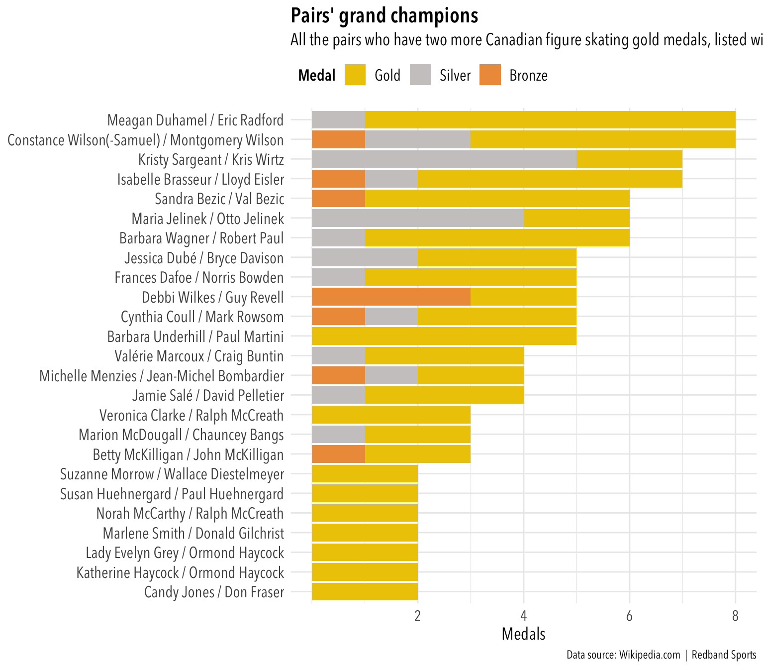
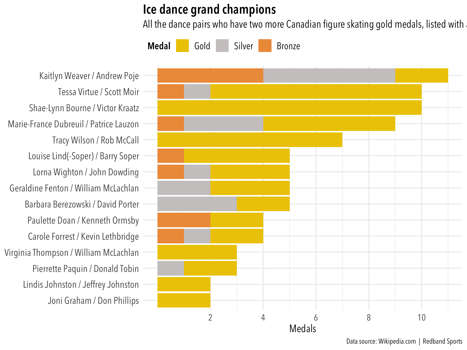
These four plots were prepared for publication with final day coverage of the 2018 Canadian figure skating championships. There were a few troubles with the data, as seen in the code notations below. The fixes aren’t particularly elegant, but they served their purposes.
(And yes, truth be told, this is a data-viz exercise that probably could be best solved with a table rather than a plot.)
Future learning will have to tackle more efficient solutions for dealing with:
— the misrepresented accented characters (as years are added, the hard-coded fixes to names will not be work because the row positions will have changed), — string replacements (see the Constance Wilson problem in the women’s section and the Gold-Silver-Bronze alphabetizing problem)
The biggest problem was with the plot titles. For readability, it’s best to use horizontal bar charts. Previous plotting exercises showed that ggplot attaches the plot titles, subtitles and captions to the data panel of the plot, not the entire area. As plots were prepared with longer names in the y axis, the plot title and subtitle became more obviously our of whack. Attempts to use hjust inside individual parameters of theme() proved to be unsatisfying. They also became unworkable when saving the plot from default to the desired 640px width.
After creating and publishing the plots as they were, I went back to see if I could find a better solution. I finally discovered the cowplot package, which ought to solve the problem of eliminating the unwieldy spacing to the left of the title and subtitle.